Parents
/Home & Leisure
Lori Borgman: Dirty car drives her crazy
I love a clean car — no trash on the floor, no empty plastic water bottles rolling around, no fossilized fries smashed into floor mats. A clean car makes me happy.
Sometimes, if the car is clean on the inside and the outside, I’m so happy I throw it in park at red lights and car dance like crazy.
Not really. But I’m car dancing on the ...Read more

'So Old, So Young': A nostalgic masterpiece
In his newest novel, Grant Ginder gives the perfect read for 20-somethings, 30-somethings and beyond, and proves to us that friendships may come and go, but the memories never will.
"So Old, So Young" follows a group of six friends over 20 years, as the real world intervenes, adulthood beckons and they struggle to maintain their relationships ...Read more

A practical guide to staying alert in an unpredictable world
"Look Twice: Your Guide to Staying Safe in an Unsafe World, Volume I" lands in a steady, practical place. Tim Beard writes like someone who has spent years thinking about risk and then came home to translate that mindset for ordinary life. The result feels less like a lecture and more like a field manual you can carry into Monday morning.
This ...Read more

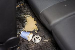
Lori Borgman: Hey doc, the pain is worst in my wallet
A document detailing our health care expenditures just arrived in the mail.
“Shocking,” I said.
“You mean the cost of health care?” the husband asked.
“No — documentation that we are officially fixer-uppers.”
There it was, right before our eyes. Three months of physical therapy for a back injury from crawling into the far back ...Read more
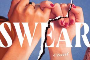
'Pinky Swear,' broken trust
""Pinky Swear" is another well-crafted story that will have readers on edge as we follow a mother desperately seeking her missing friend and her unborn child."
A baby’s on the way, but the mother goes missing…
Have you ever broken a promise? How about a pinky swear? Alexandra “Lexie” McNeil can’t have children of her own, to the ...Read more
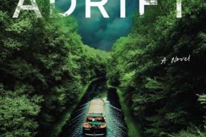
Trapped at sea: Survival and hard choices in Will Dean’s 'Adrift'
Life is full of choices. A simple twist of fate can send someone towards a winning lottery ticket or into a life filled with fear, confusion and sadness. Life choices can also be a breeding ground for resilience and determination. In the new novel, "Adrift" by author Will Dean, Peggy Jenkins and her son Samson, struggle to make good life choices...Read more

Lori Borgman: The question that still lingers
We have a long-standing affection for courtroom dramas. “Perry Mason” set the standard years ago. He’s still questioning witnesses, introducing dramatic pieces of evidence, and consulting with Paul Drake and Della Street in black and white, albeit in the wee hours of the morning on local channels.
When Andy and Barney finished corralling ...Read more
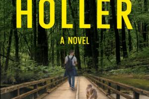
A Southern Gothic mystery that knows what secrets cost
When RJ Burnette returns to Gizzard’s Holler, he tells himself he is coming home to regroup. New York City is behind him — the finance career, the ambition, the version of success that looked good on paper but felt increasingly hollow. With his dog Winston beside him, RJ drives back to the Tennessee mountains believing he can reset his life....Read more
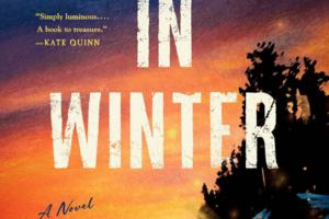
Through snow and silence, love endures in 'Fireflies in Winter'
"Fireflies in Winter" is a vividly realistic historical fiction by the author of "River Sing Me Home," Eleanor Shearer. Set in 1796, the story revolves around a young Jamaican woman named Cora, who is forced to leave her hometown of Trelawny Town because of war and seek refuge in Nova Scotia, Canada.
Cora and her loved ones have recently ...Read more

Lori Borgman: Introducing ink-redible grandmas
Grandma is close at heart. Literally. And permanently.
A picture was in this morning’s paper of a young man proudly showing a tattoo of his beloved late grandma on his chest, along with a quote from her.
Sweet. Very, very sweet.
Naturally, with 11 grands, I ask myself, “What are the chances?”
At this stage of the game, the best I could...Read more
6 thrillers where beautiful people make bad decisions
Money buys silence. Status buys patience … And reputation? Well, that buys second chances.
The following novels understand this all too well, and dismantle the privileged systems without mercy. Set among rehab centers built to protect the famous, towns that quietly adjusted to old crimes and communities governed by image and inheritance, ...Read more

Lori Borgman: Sometimes the reviews are fishy
In this Age of Review and Return, almost 93% of all shoppers read reviews before making a purchase. Even though we review before we buy, we often return the purchase after it arrives.
There was a time when returns were a rarity. Oh, there were exceptions, but you had to face a stern clerk, who often consulted a stern manager. Now, you just ...Read more

When forgiveness fails, vengeance thrives in Caroline Glenn’s 'Cruelty Free'
That uniquely magical moment when a novel knocks you flat and makes you ask, “Did that really just happen?” The joy of reading a passage multiple times to revisit the delightful insanity that liberates the reader from their reality.
In "Cruelty Free," author Caroline Glenn delivers a number of these moments in a playfully sinister new ...Read more
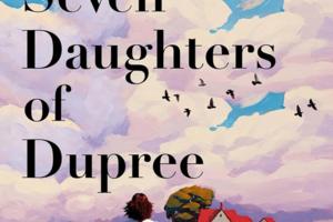
'The Seven Daughters of Dupree' weaves a haunting tapestry of Black womanhood
Nikesha Elise Williams starts the prologue of "The Seven Daughters of Dupree" with a sentence so horrible readers will hope it’s a metaphor for something less unthinkable. And then, as though taking the hand of a reluctant child, Williams pulls her readers into the first chapter – and into a hair salon where we meet the first of seven women ...Read more

Lori Borgman: The reason it's called HARDware
I can catch a plane, a ball, a cold and the flu, but the one thing I can’t catch is home improvement skills.
I recently painted a small bathroom cabinet. The project took three days, not including 11 trips to the big box hardware store.
Meanwhile, on six different cable channels, people with home improvement skills ripped out small half-...Read more
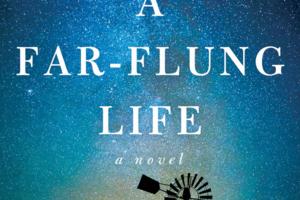
M.L. Stedman’s 'A Far-Flung Life' is a sweeping saga of grief and enduran
What happens when your life falls apart? Not just once, but over and over again? When you’re constantly reminded of your mistakes? When there is no true way to atone for these mistakes?
In her first novel in over a decade, M.L. Stedman seeks to answer these questions in the epic family saga, "A Far-Flung Life."
The book centers on the ...Read more

A beautifully doomed love story in 'The Girl from Melodia'
"The Girl from Melodia" by Jonathan Toussaint is a literary tragedy set in the early 1990s France and England against the backdrop of the folk music scene, taking the reader from the gritty realism of the Tulle Folk Festival to a claustrophobic houseboat on the River Lea. Unreliable narrator Martyn Lockhart, son of the infamous folk singer John ...Read more

Ashley Winstead’s 'The Future Saints' hits an emotional high note
"The Future Saints" by Ashley Winstead is an ambitious novel, expansive in its concerns: sisterhood and family, the highs and lows of the music industry and the long-term consequences of mental illness and addiction. The novel is at its strongest in its close attention to daily interactions—among the band members themselves and with the record...Read more

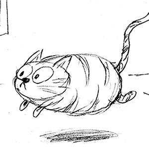
Lori Borgman: A blanket statement we can cover
It happened at our oldest daughter’s place. I rang the bell, peeked in the side window and saw an ill-defined, furry mass lumbering toward the door.
My mind flashed back to my days in the Pacific Northwest when Bigfoot sightings were common. Was it a Bigfoot sighting? Here and now, in a sprawling suburb?
As the creature drew closer, I could ...Read more

Moms: Safe harbors: 6 books that explore second chances
These six novels delve into the complexities of the human heart, exploring love, loss and the transformative power of redemption.
From haunting journeys of trauma and healing to moral dilemmas, unforgettable friendships and the weight of memory, each story invites readers into richly drawn worlds where courage, faith and the struggle to ...Read more
Related Channels

Focus on the Family
By Jim Daly

Georgia Garvey
By Georgia Garvey

Lenore Skenazy
By Lenore Skenazy
Comics